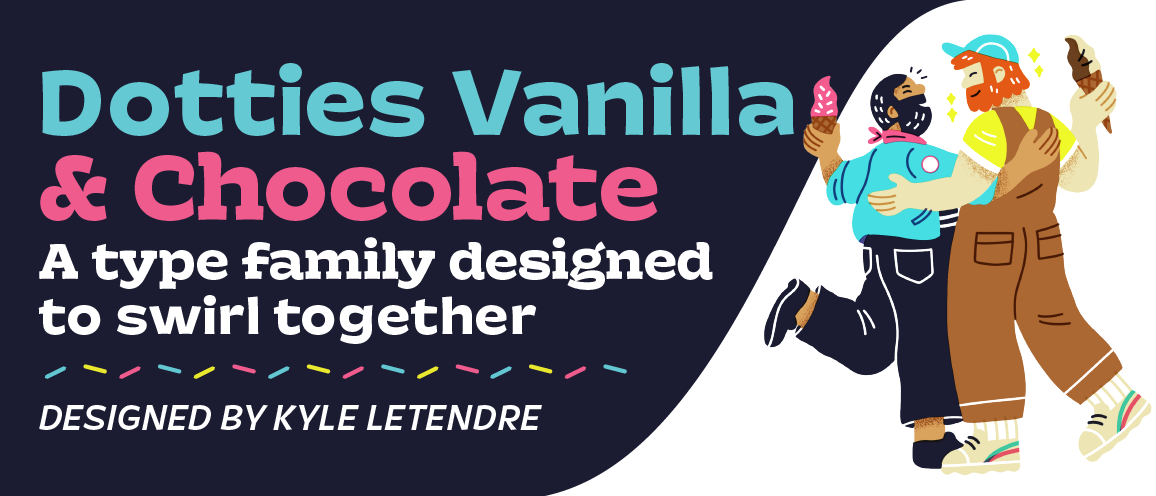
The two sub-families of Dotties (Vanilla and Chocolate) are humanist typefaces with a twist. Mixing the charm of hand-painted signs with the utility of a digital typeface, the Dotties fonts fuse personality with performance, making them ideal for use in headlines, text and logotypes.
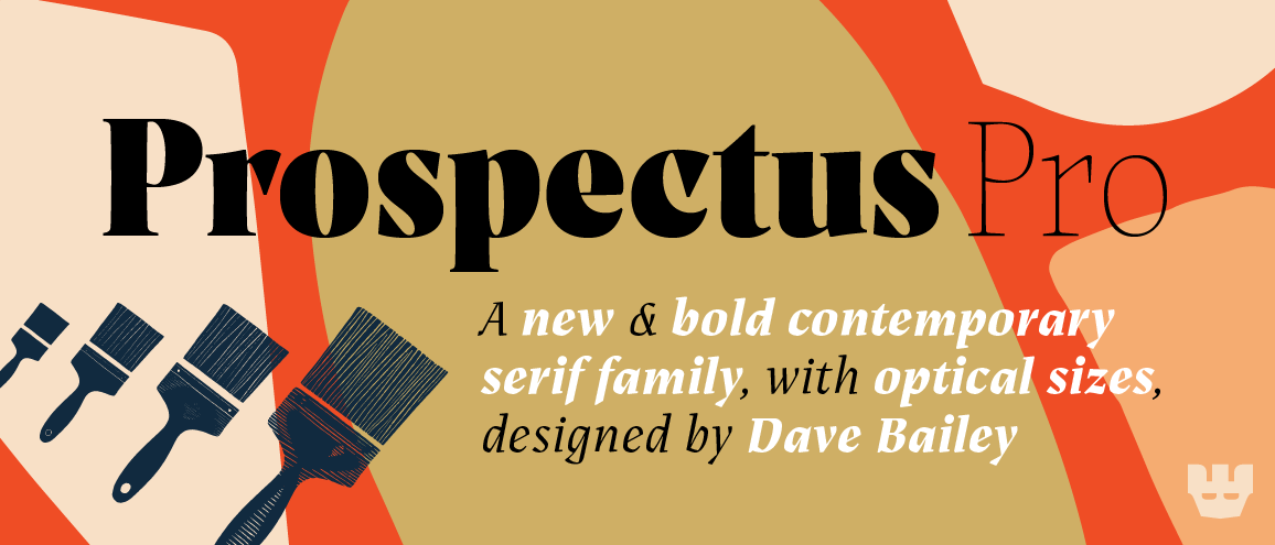
Prospectus Pro is a new and bold contemporary serif typeface in 48 styles, designed by Dave Bailey, and available exclusively from The Lost Type Co-op. Try the fonts yourself on the mini-site here!
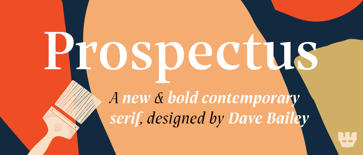
Prospectus is a new and bold contemporary serif typeface in 12 styles, designed by Dave Bailey, and available exclusively from The Lost Type Co-op. Try the fonts yourself on the mini-site here!
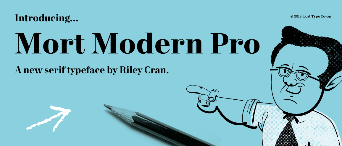
A serif typeface in 56 styles (including optical sizes, widths and weights) designed by Riley Cran, inspired by the mid century advertising lettering of Mortimer Leach. Mort Modern is suited to editorial, branding and advertising uses. Check out the mini-site here!
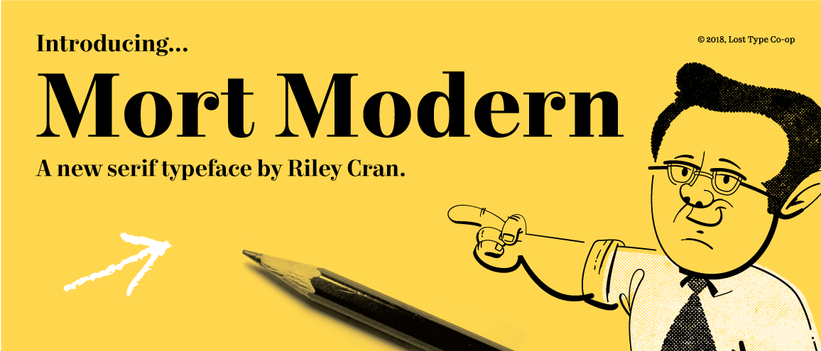
The standard Mort Modern family has 24 fonts designed by Riley Cran, inspired by the mid century advertising lettering of Mortimer Leach. Well suited to editorial, branding and advertising uses. Check out the mini-site here!
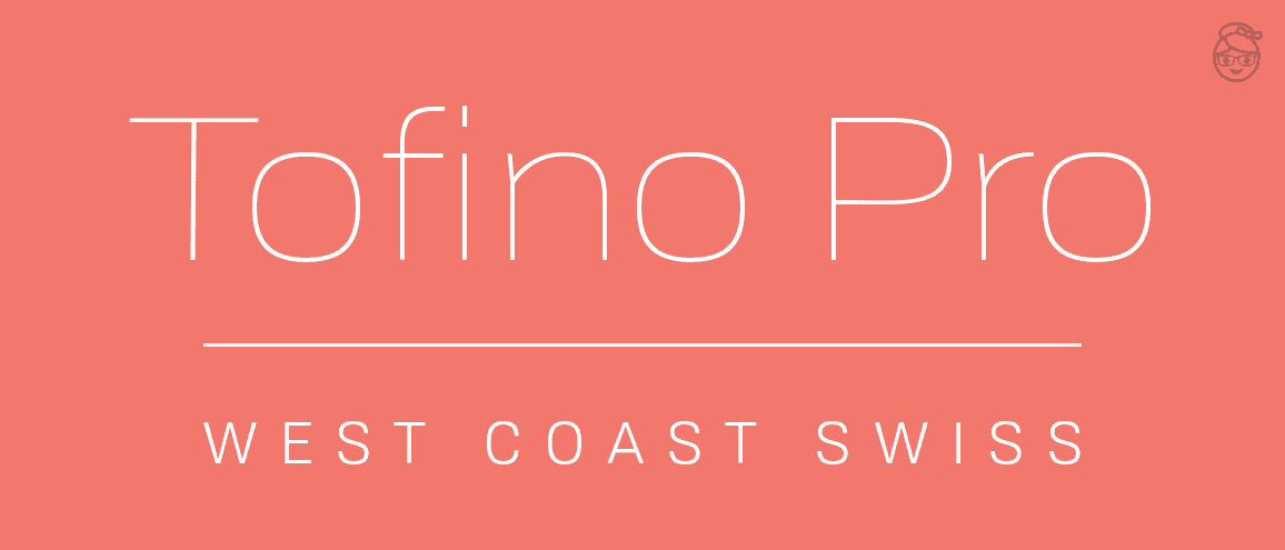
The full Tofino family with 74 styles including nine weights, four widths, and text-specific styles. Tofino is designed to help you express all the things you love about Swiss style typography but with more hang loose attitude. Learn more and explore all of Tofino's features on the specimen site.
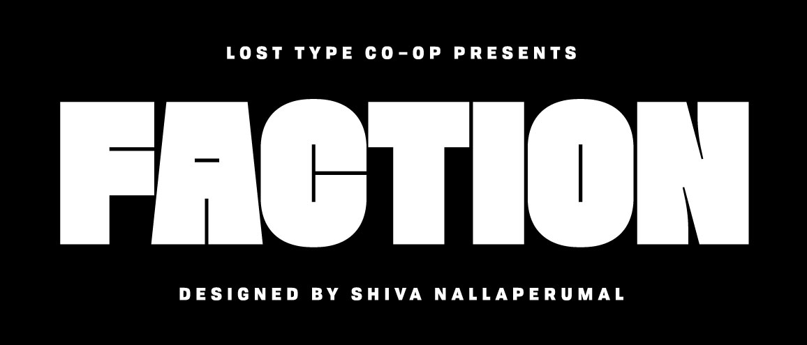
A new display typeface by Shiva Nallaperumal, Faction comes in two styles: Display and Outline. With a custom drawn outline style, and a unique attention to positive and negative space, Faction packs a punch for display uses. Check out the minisite too!
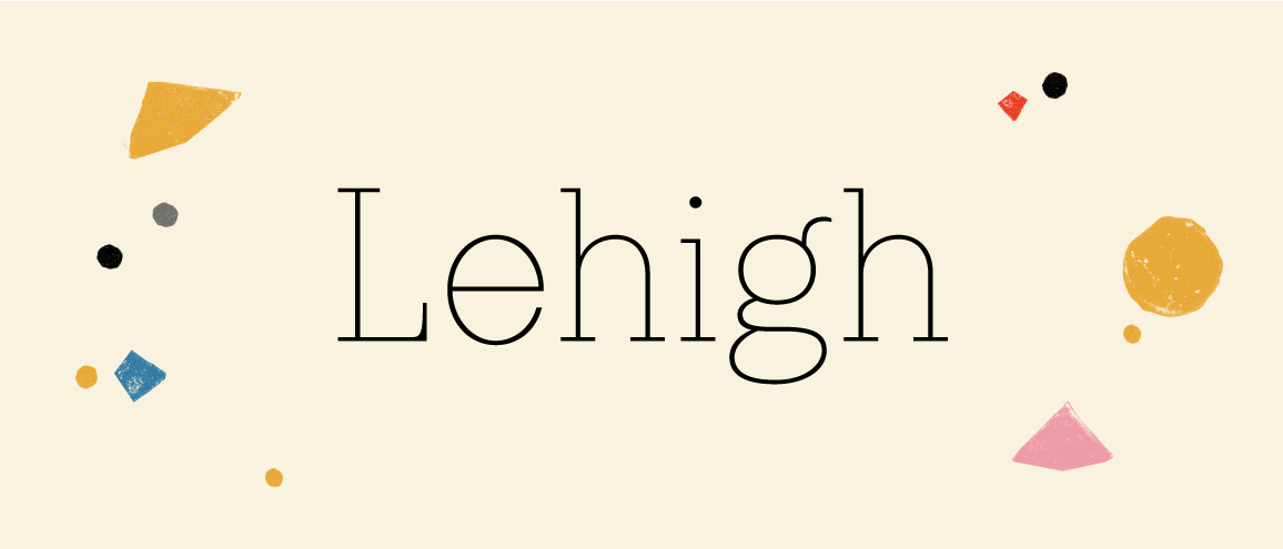
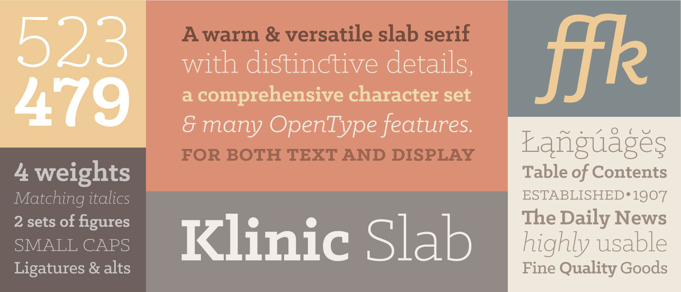
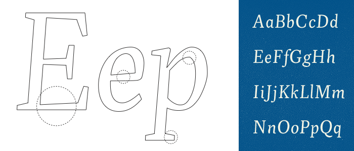
Drawing from 100 years of slab serifs with rationalized, succinct characteristics, Lehigh marries the charm of antique slab serifs with the functionality, language support, weight range, and special features you'd expect from a contemporary typeface. The Lehigh family will bring the charm of a slab serif to a variety of situations to elevate your design work.
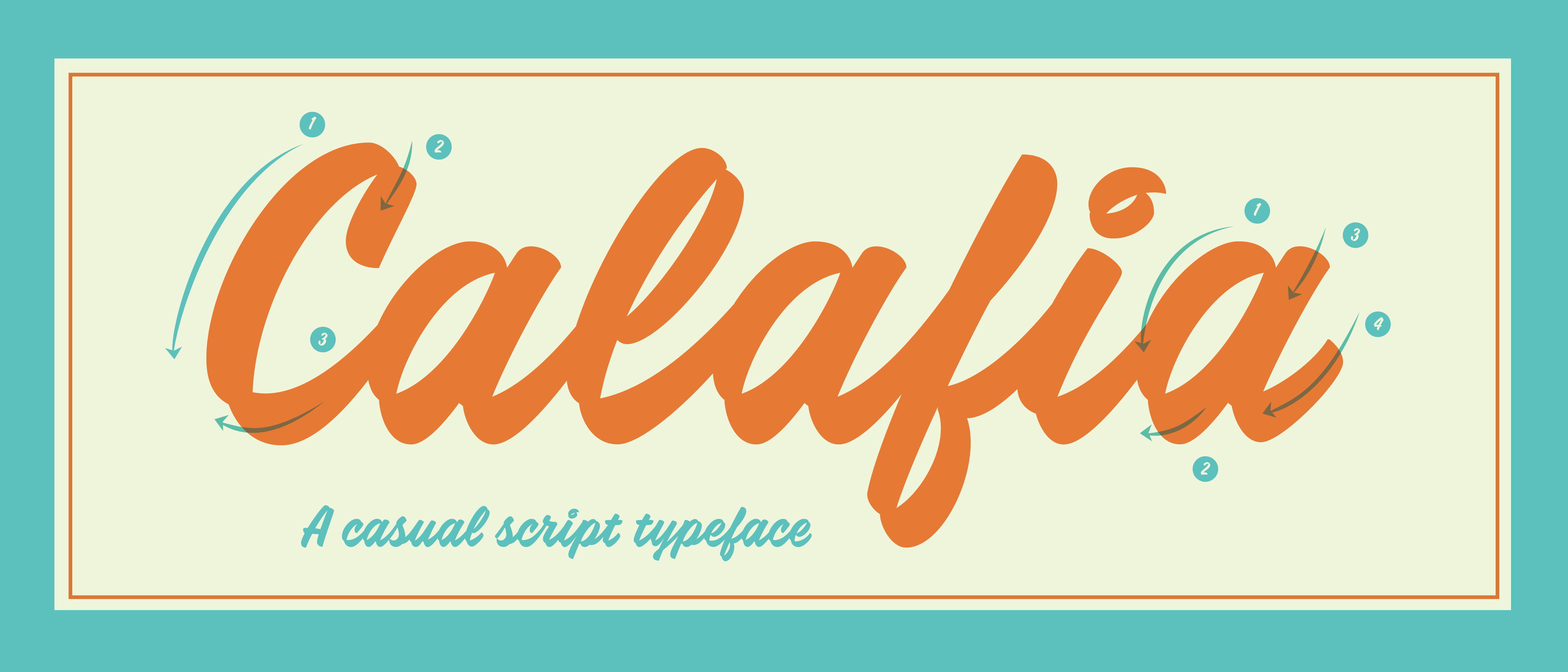
Calafia is a script inspired by left handed brush lettering. Perfect for advertising headlines and logotypes, Calafia includes final forms for natural word endings, and an alternate set of caps for cap-specific settings, all supporting more than 100 languages.
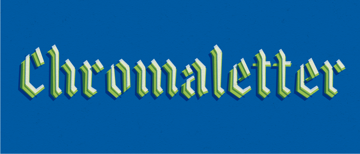
Chromaletter breathes life into calligraphic forms, with 5 fonts which can be layered in various combinations to powerful effect. Every glyph of Chromaletter is constructed from straight lines, and variations of every letter add a subtle energy to words. Perfect for posters book covers.
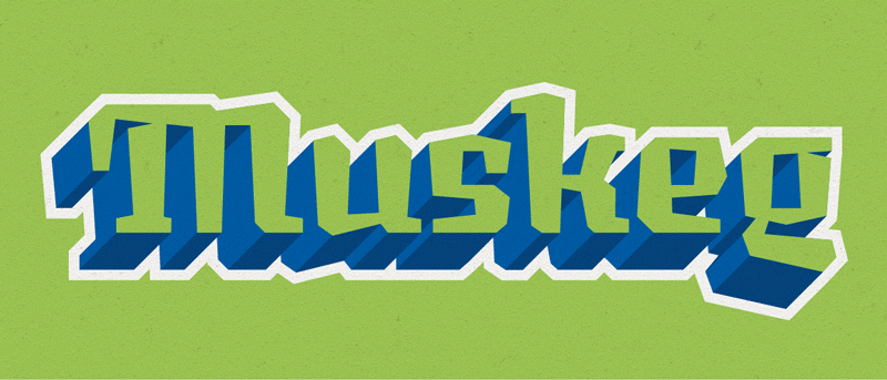
Muskeg, born from the swamps of experimental lettering, is a combination brush & blackletter inspired typeface with the additional aesthetic of lacking any bezier curves. Muskeg is a 6 weight display family, including swash caps and support for over 200 Latin languages.
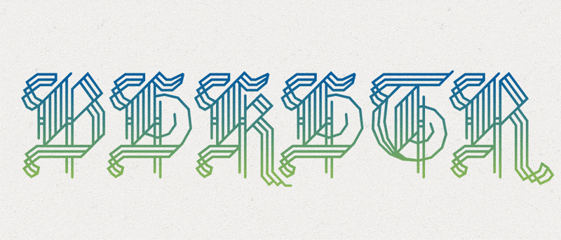
BLKLTR is 3 style interpretation of blackletter drop caps, delivered in both 'curved' & 'no-curve' aesthetics. BLKLTR caps shine on their own as initials, but also includes contextual alternates to play well with the rest of the team in evenly spaced words or phrases.
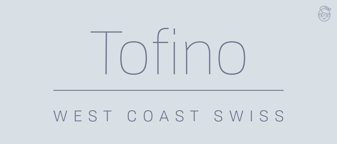
Tofino has nine weights with companion italics. It's the "West Coast Swiss" typeface - taking the best parts of Swiss style and adding warmth and character. And since it's specifically designed for the screen, check out the specimen site and see it in action! For more widths and text-specific styles of Tofino, check out Tofino Pro!
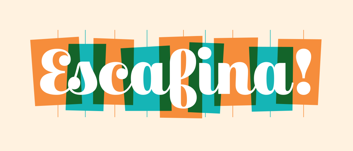
Escafina is an upright script in 3 styles, drawing from decades of inspirational lettering. Escafina is great for logotypes, headlines, posters and other uses.
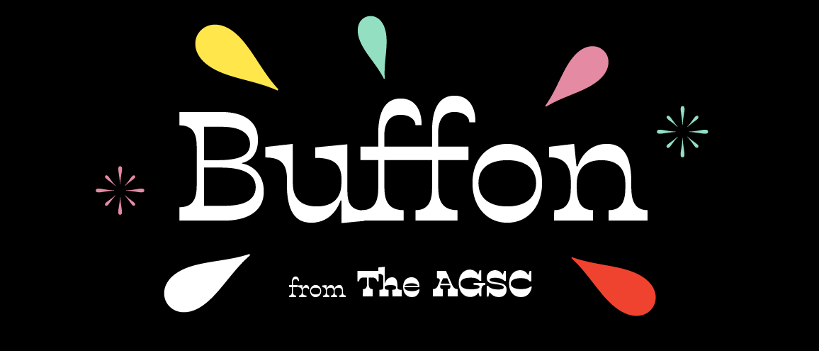
Buffon is a reverse-contrast display typeface with a playful personality and very sassy heavy weight. With four weights, a generous character set, and ligatures & stylistic alts, Buffon shrugs off the tired Spaghetti Western stereotype so often associated with reverse-contrast--but could make a very nice Wanted poster, if the need arose.
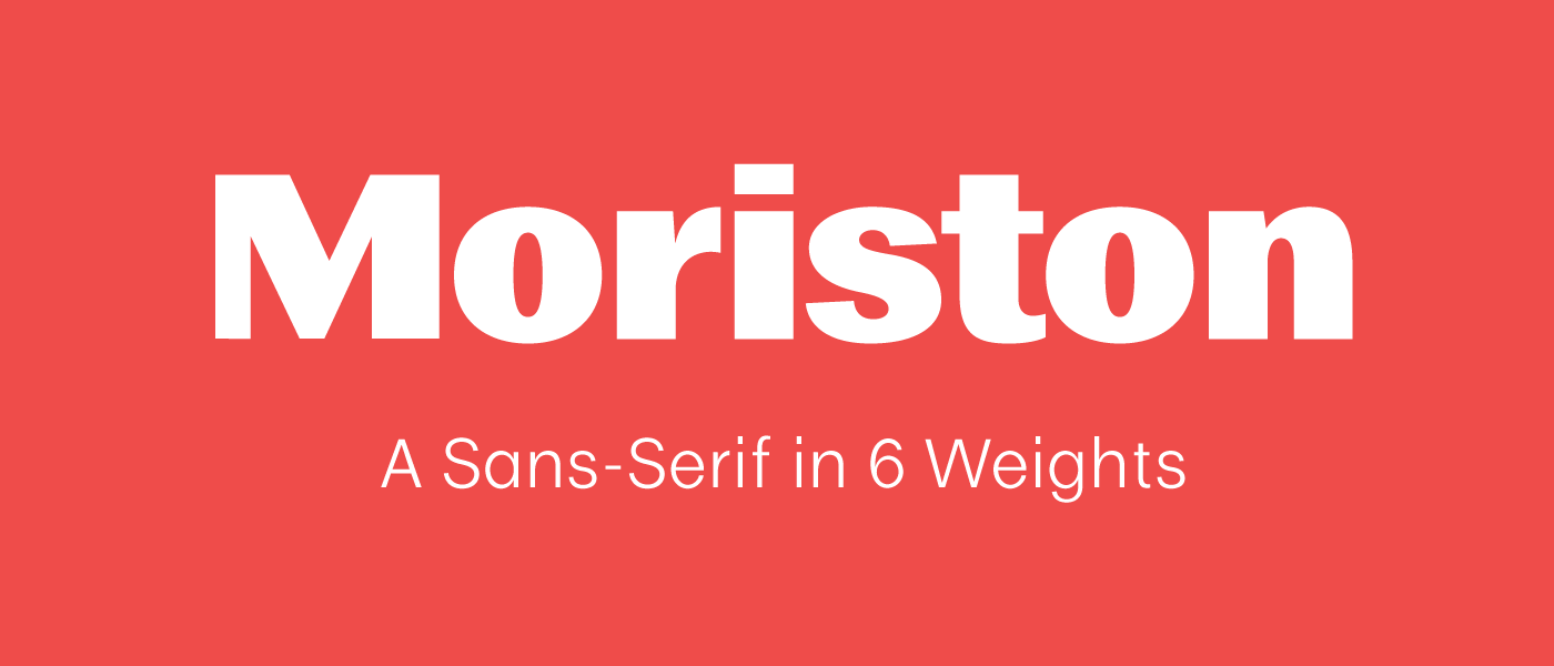
Adding contrast to a conversation makes your voice stand out. Moriston is a sans-serif grotesque available in 6 reliable weights, with support for over 200 languages and a variety of additional number styles. Make sure to check out the mini site!
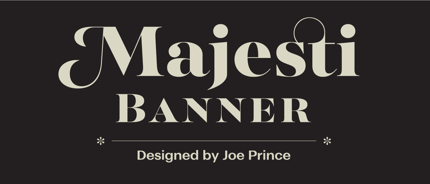
Majesti Banner is the first release in a new family that will also include a text and display version in the future. Its high contrast letterforms, ball terminals, and variety of OT features make it a highly suitable typeface for large point settings. Majesti Banner is available in 5 weights with matching italics, and is also available as a webfont.
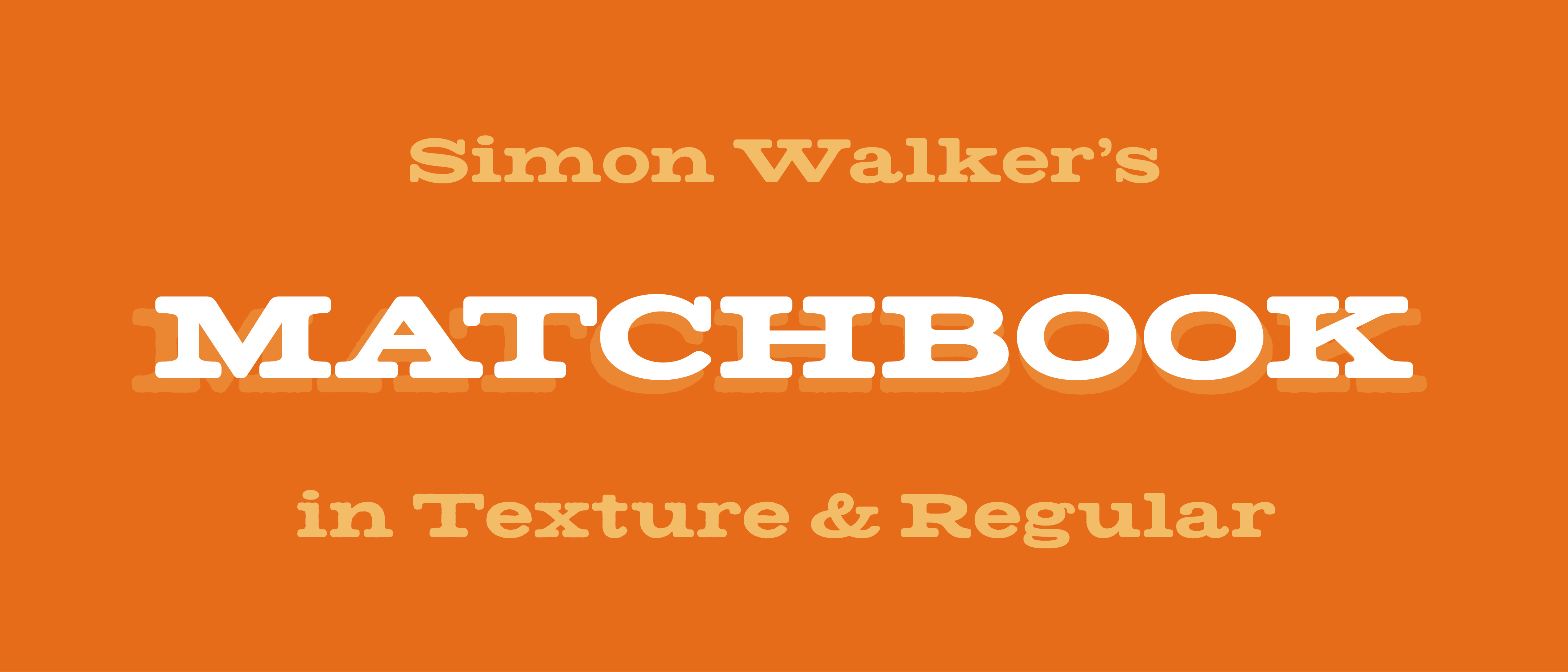
Matchbook is Simon Walker's first typeface release, evolving from lettering drawn for sub-headings in his own pieces. Its extended forms and rounded serifs create a characterful and unique tone in headlines. It includes a textured version with rough grittiness reminiscent of enlarged letterpress type.
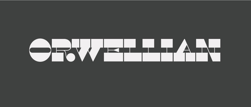
Orwellian is a reversed-stress typeface designed for display use. It was inspired by the concepts explored by George Orwell in his monumental work Nineteen Eighty Four and follows Henry Caslon's Italian model. Read more about the development here.
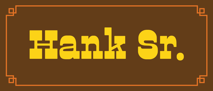
The reverse contrast Dude family is now joined by three newcomers, Hank Sr., Hank Jr. and Hank III. It is also joined by a brand new Catchwords font which features over 30 catchwords and 14 Manicules.
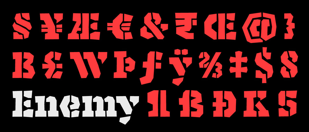
Enemy is a bold stencil typeface for display use, originally designed as a custom face for the identity design of the Museum of Urban Art. It has been designed with the Latin Extended A Character set and has advanced open type features to support automatic rotation of alternate glyphs.
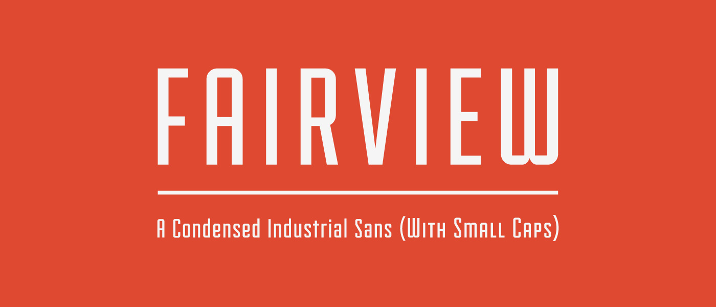
Fairview is a condensed industrial sans serif, which includes a regular and small cap variation.
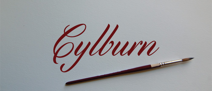
Cylburn is a semi-connected script structurally based on Roundhand but written with a pointed brush and restrained tension that separate it from its traditional roots.
Co-created by
Trevor Baum.
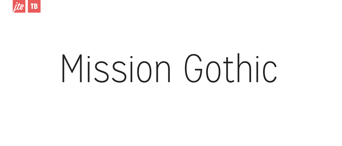
Mission Gothic is a relic; a ghost from an era where letters were hand-painted on wood and glass. Made up of five weights and two styles, Mission Gothic is one of the most expansive type families available from Lost Type Co-op.
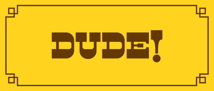
Dude is a reverse contrast cowboy font thats got true grit. It's not about weight, its about style. Twelve different serif styles inspired by country musics legends. Whiskey drinking, train hopping, fist fighting, hard loving, prison breaking, men and women, who poured their hearts out in song.
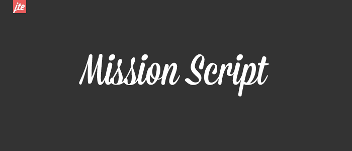
The first of the Mission Collection, Mission Script is a signage-lovers wet dream. Condensed, casual, sweet, and sincere. A celebration of the brush. Scripts rule.
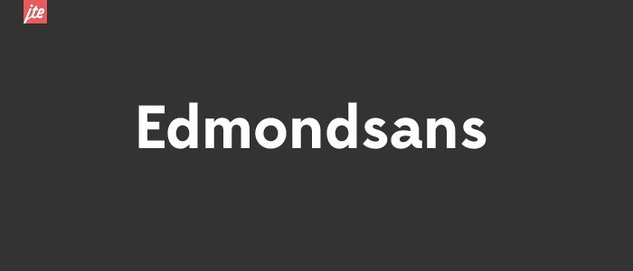
Edmondsans is hard-working display face in three weights, featuring some useful niceties like small caps, non-lining figures, and a few alternates.
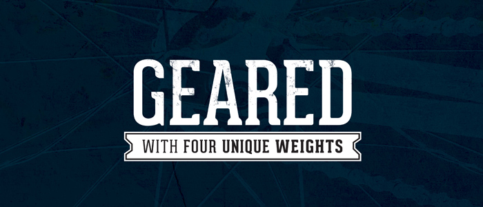
Geared is an industrial inspired Condensed Slab Serif in 4 weights (Thin, Regular, Bold, Extrabold). With an extensive character set, Geared could be a versatile addition to your next project.
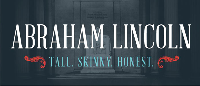
Inspired by the proportions of the 16th President of the USA, and advertisements/playbills of the 1800s, Abraham Lincoln is a humanistic display face with moderate contrast and sturdy serifs.
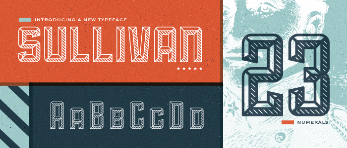
Not your traditional modular typeface. Sullivan is a bold display face that comes in three variations. Each can be used effectively on their own or layered for a uniquely modern, industrial effect. Originally inspired by the letter "S" design by Scott Allen Hill of Foundry Collective.
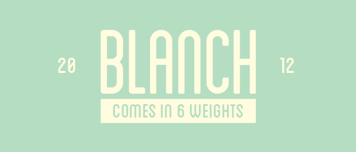
Blanch is a display face, designed for the 'Fruita Blanch' brand, a family-run company. A traditional font with a contemporary feel, The Blanch typeface family is comprised of 6 weights; 3 condensed weights and 3 caps weights.
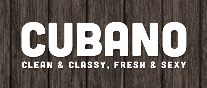
Cubano's personality is defined by its rounded corners, wide strokes, and semi-condensed letterforms. Featuring 167 glyphs, Cubano is available in all caps with numerals, punctuation, symbols and most accent marks. And with webfonts included, you can easily solidify your next site with Cubano!
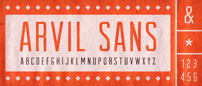
Arvil has strong lines with rounded, soft terminals, to produce a strong, yet friendly letterform. Available in all caps with numerals, punctuation and also a wide range of symbols, Arvil is versatile and sure to deliver your next message with style.'
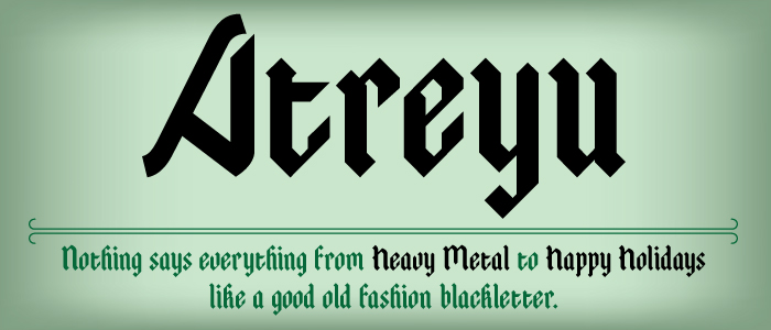
Atreyu is a contemporary textura blackletter inspired from Gothic Illuminated Manuscripts of 14th century Germany. I've always had an affinity for blackletter since I grew up drawing calligraphy. And lets face it nothing can say Heavy Metal to Happy Holidays like a good old fashion blackletter.
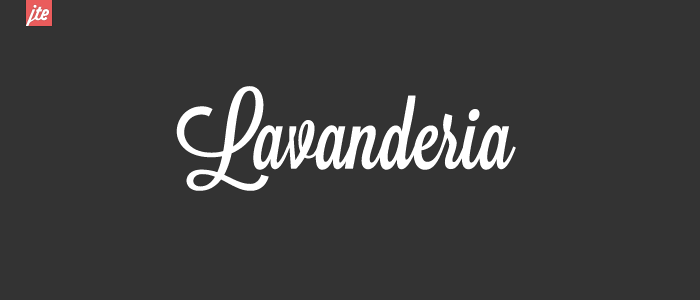
Based on lettering found on Laundromat windows of San Francisco's Mission District, Lavanderia features numerous opentype features and three weights.
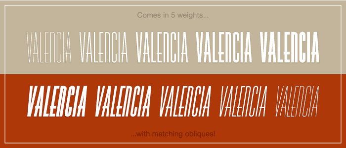
Valencia is condensed typeface that includes 5 weights, ranging from Hairline to Black, with matching obliques for each weight. It's great for large headlines and prints seamlessly for any collateral or stationery. Valencia's uniqueness stems from it's low horizontal crossbars and its full-circle curves.
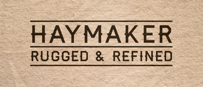
A display typeface that's both rugged and refined. Inspired by the workmanship, lettering, and baseball jerseys of the 1930's and 40's.
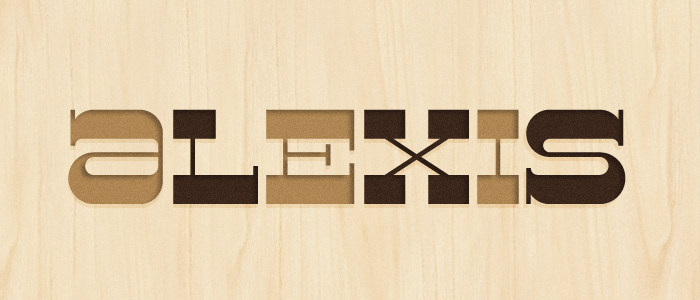
A mid-century modern inspired typeface, Alexis is a reverse contrast slab serif with a lot of sass. Assembled by Nathan Williams .
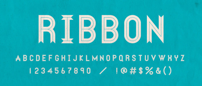
First appearing as a Numeral Set, Ribbon is now a full display face, including Opentype features for an alternate alphabet. Now shipping with the Ribbon Specimen Book.
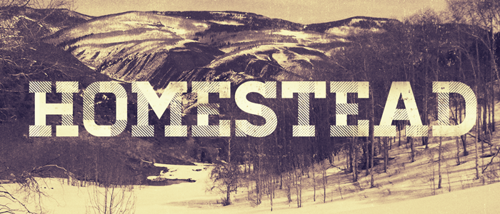
Inspired by our desire and need to explore. Always searching for the place to call home.
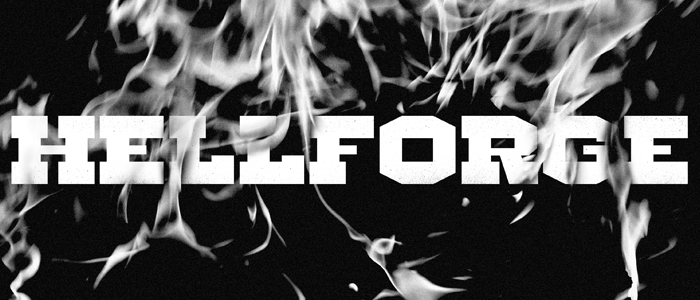
Inspired by the infernos of the coal mill, Hellforge is a molten-hot headline slab cast with factory-grade craftsmanship.
Saddle up! This weighty display face comes custom fit with the spurs. Originally only offered in an italic, the family is now joined by a Roman and 2 shadow styles.
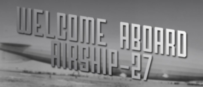
Airship-27 was inspired by Airships of the late 19th century. It has a very distinctive look and feel that can strike attention anywhere.
A Bold, Geomteric Sans Serif in two styles (Regular and Cut). 122 Glyphs per Style. Includes a Sweet Lightning Bolt character.
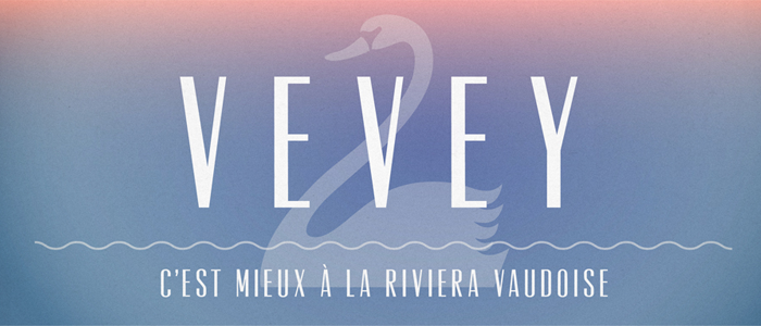
Vevey is a dreamy, refined sans serif inspired by a vintage travel poster found in the Swiss Riviera.
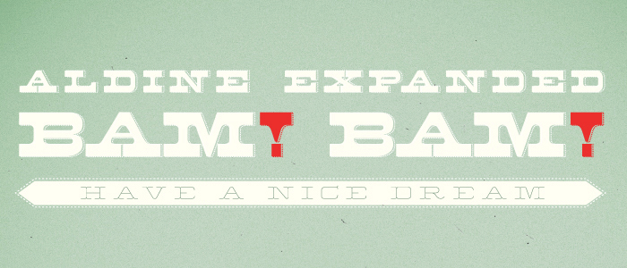
Created from original proofs of a 19th Century American Wood Type alphabet, Aldine Expanded was created and embellished by Javier Viramontes at the University of Texas, Austin.
Two fonts with a complimentary feel. One serif. One sans serif. Both contain the full character set plus ligatures. 400+ glyphs in total.
A condensed uppercase typeface with regular, thin, inline, and bold weights.
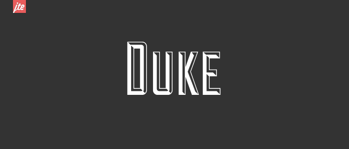
Based on the signage for the Cup and Saucer Luncheonette in New York, Duke features three layers: Fill, Shadow, and Fill+Shadow.
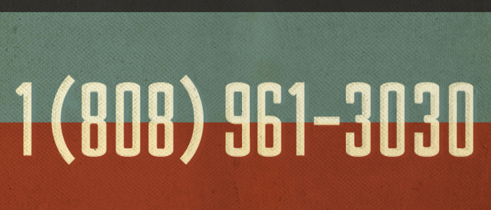
Ministry is a numeral set fabricated for antique cars, phone numbers and anything deemed timeless.
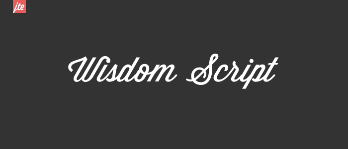
Wisdom Script was originally designed for Woods of Wisdom, a 50 part poster series on bad advice.
Beautiful line width variation in this condensed sans-serif. Perfect for an elegant modernist headline.
The font that kicked this whole thing off, originally designed in 24 hours, and now back (new and improved).
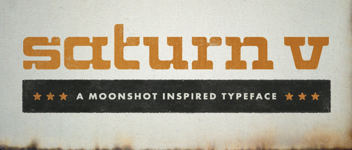
A heavy-duty, lowercase slab-serif inspired by the monumental Saturn V rocket that carried men from the earth to the moon.
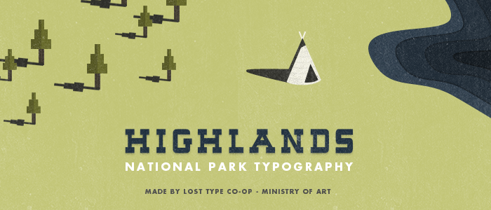
Highlands is a charming slab-serif that draws inspiration from National Park posters of old. Versatile in its character, it makes for great headlines.
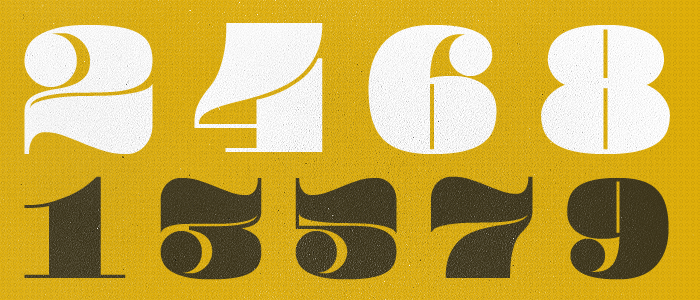
Pompadour is a chunky, display numeral set inspired by the 1950s Rockabilly Hairdo. The numbers, which each fit perfectly inside of a square, are best used a large sizes.
A Bold addition to any project, this ultra readable sans serif radiates 'badass'. Font includes an extensive set of accent characters, and symbols not found in most faces.
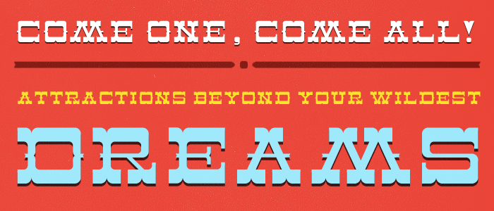
Featuring heavy serifs and subtle curves, it recalls old-fashioned print styles found on posters and broadsides promoting traveling circus troupes. Prior to WWI and talking pictures, circuses were a national pastime crossing the country coast to coast by train.

Deming is a great display face that can be used in sizes both big and small.
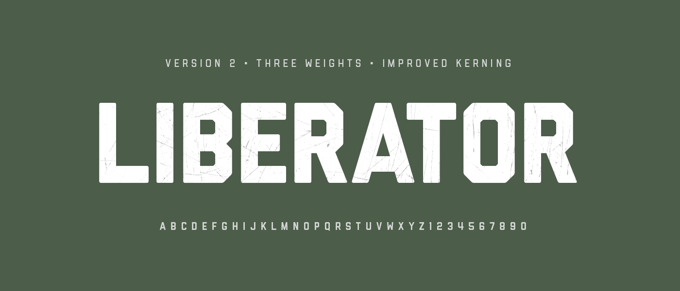
Liberator is from a bygone era, when our grandparents fought for the freedom we enjoy today. Now remastered and in 3 weights, this bomber-inspired face provides a masculine punch to any project or design. Full Alphabet with glyphs and numerals.
The typeface follows the humanist model of Ludovico Arrighi's italic type from Renaissance Italy, but its calligraphic details have been simplified to create a friendly voice. Pigeon also incorporates some of the "sparkle" that gives drama to the Dutch Baroque types of Johannes Fleischmann, referencing the nobility of letter-writing.